
02Case study / Brand build-out
Baykin Apparel. Mad Salty since 2020.
A surf and skate apparel brand I started with a few of my closest friends during the 2020 lockdown. I designed the brand: the name, the logo, the tagline, the clothes, the packaging and the social posts.
AThe brief
Stand out in a crowded market.
Surf and skate clothing is what we always wore, so that's what we set out to make. The problem: apparel is one of the most crowded markets there is.
To stand out we needed three things. A name people remember, a logo with a second meaning, and a voice that's fun to wear.
- 01Naming and story
- 02Logo, wave mark and tagline
- 03Colors and type
- 04Apparel graphics, tags and packaging
- 05Social posts and product photos
BThe name
A name with a hidden joke.
The Chesapeake in Maryland and Tampa Bay in Florida. The water we all grew up on.
Family. The people closest to you, and the community we wanted to build.
Now say it fast. It sounds like bacon, and that was on purpose. Everyone loves Baykin.
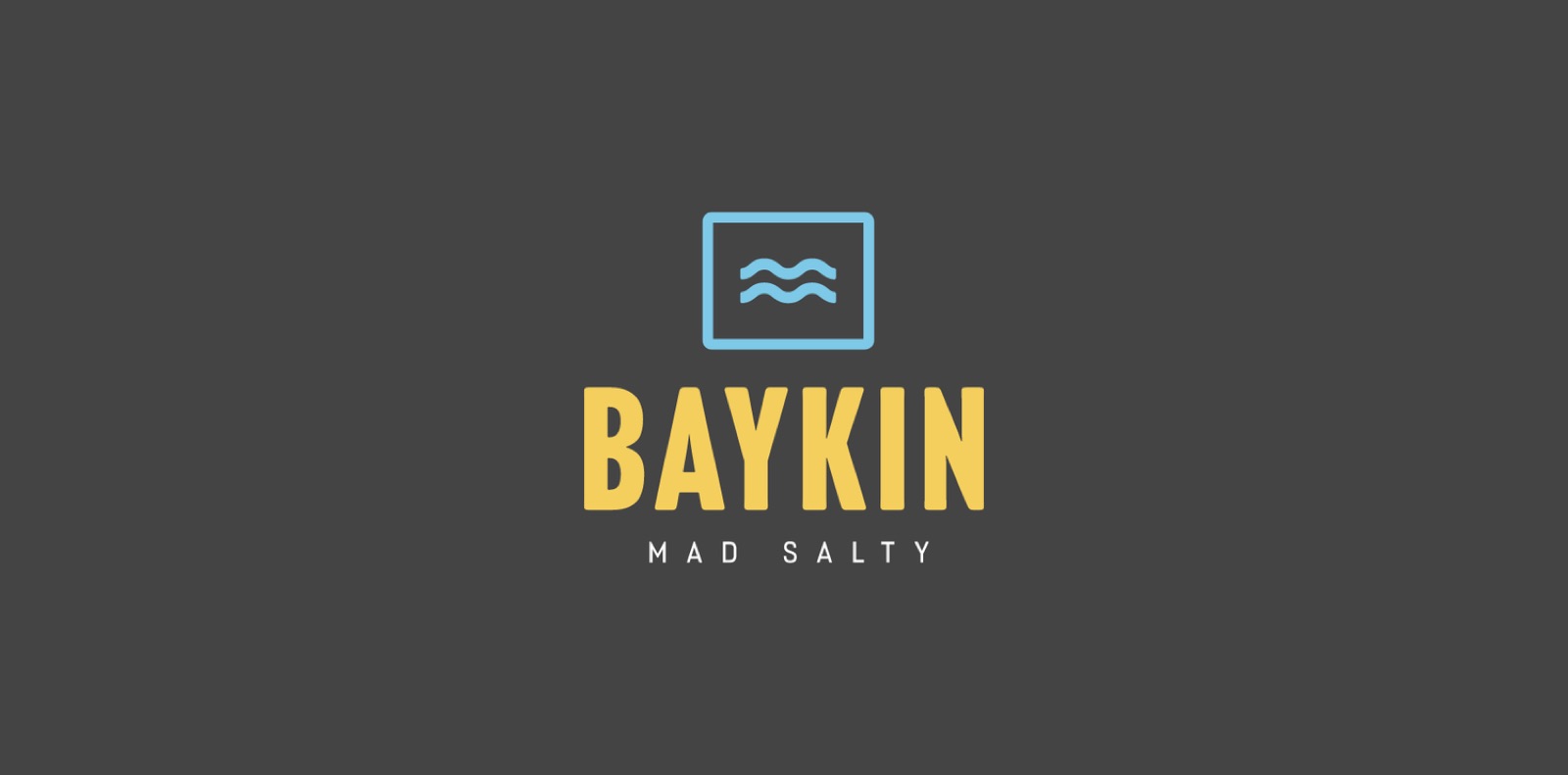
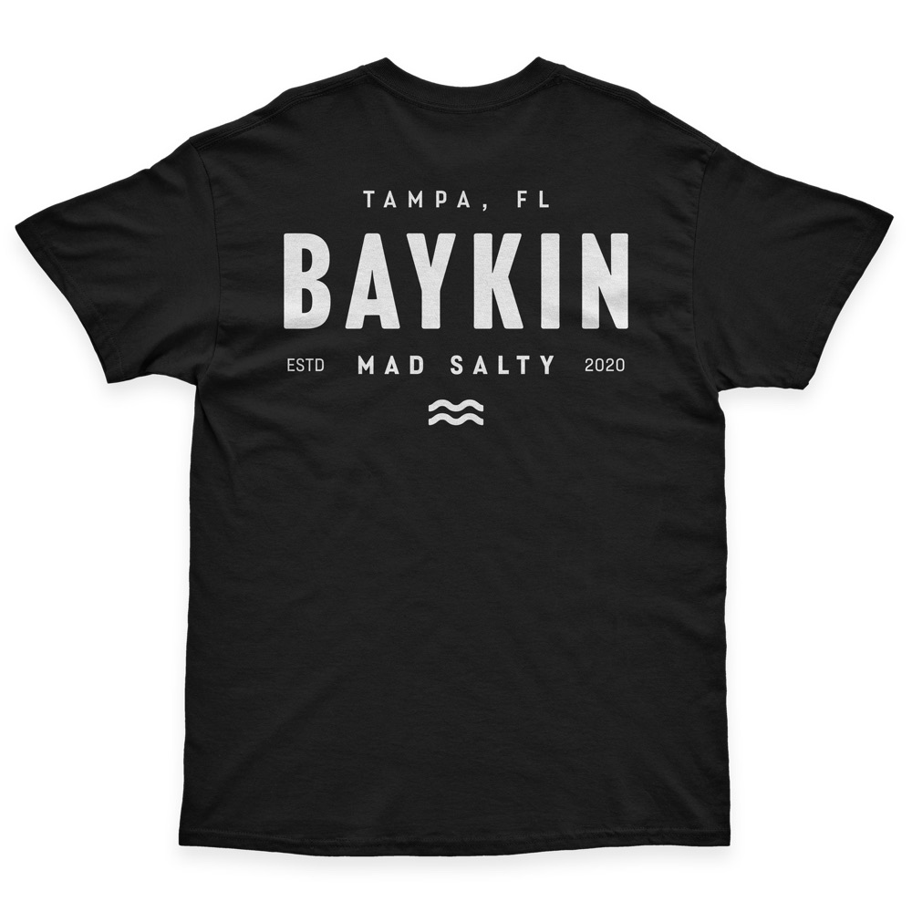
The tagline: Mad Salty
Three meanings in two words: the saltwater life, a wink back to bacon, and salty as slang for annoyed.
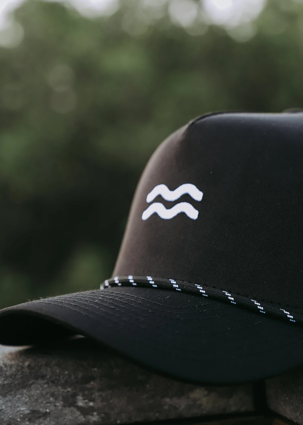
The mark: two wavy lines
At first glance it's water. Look again and it's a strip of bacon. It ties the surf side and the joke together in one simple shape.
The identity
One lockup, three colors from the shoreline, two typefaces.

- Wordmark
- Headline Gothic ATF Rounded
- Tagline
- Lutschine Medium
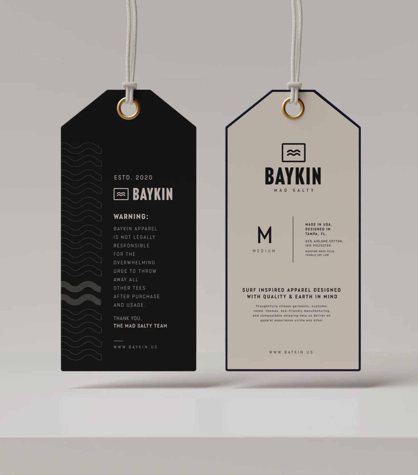
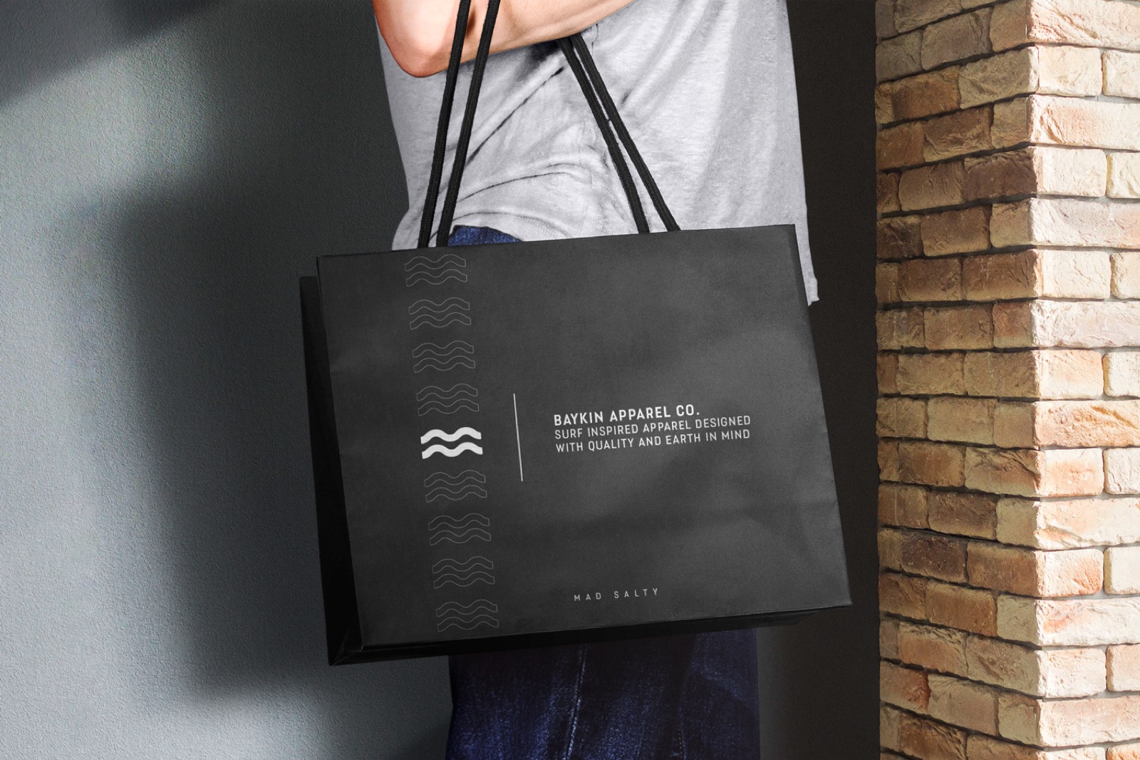
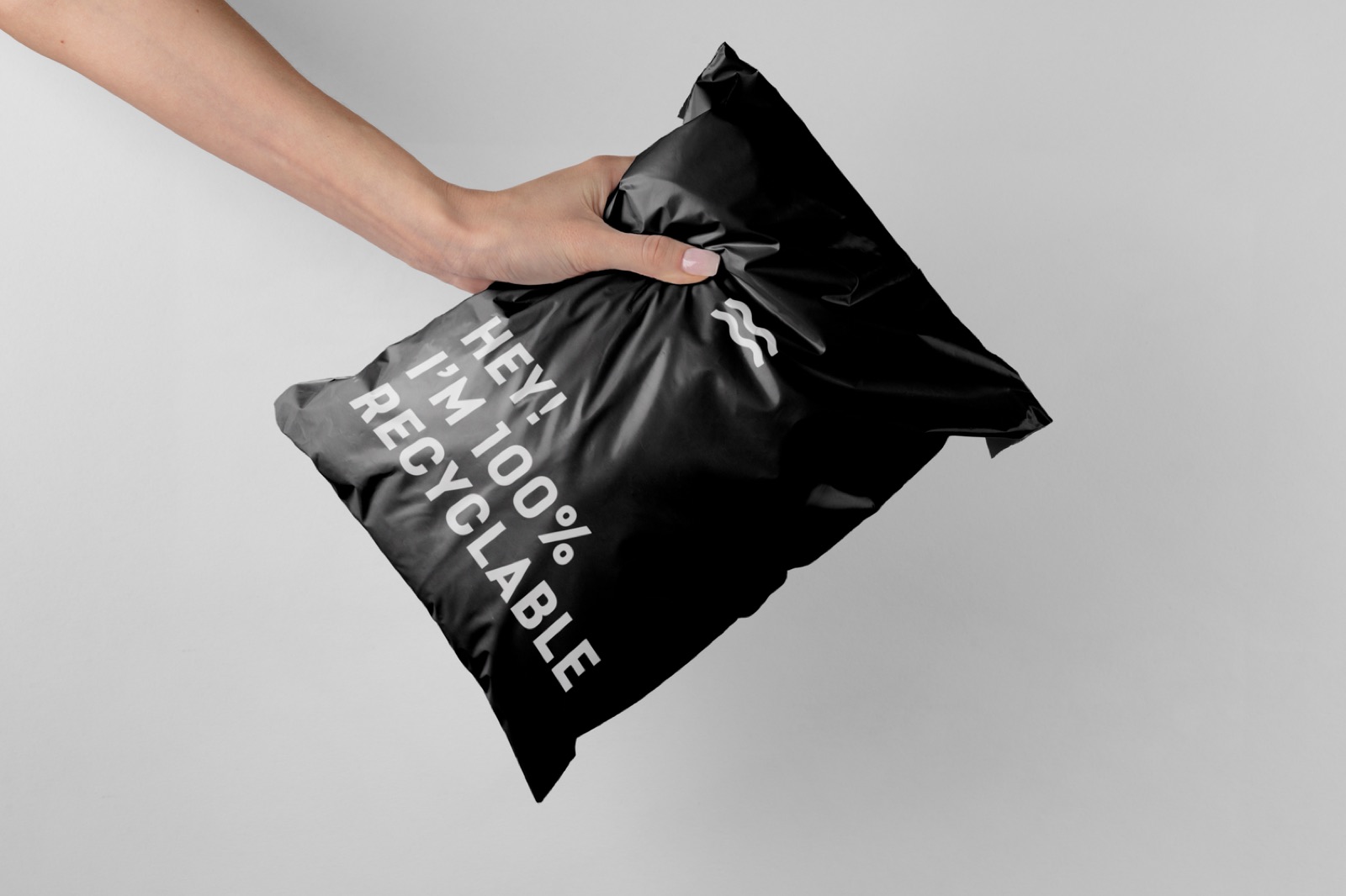
Tags and packaging
Recyclable mailers to match a brand built around the water.
The drops
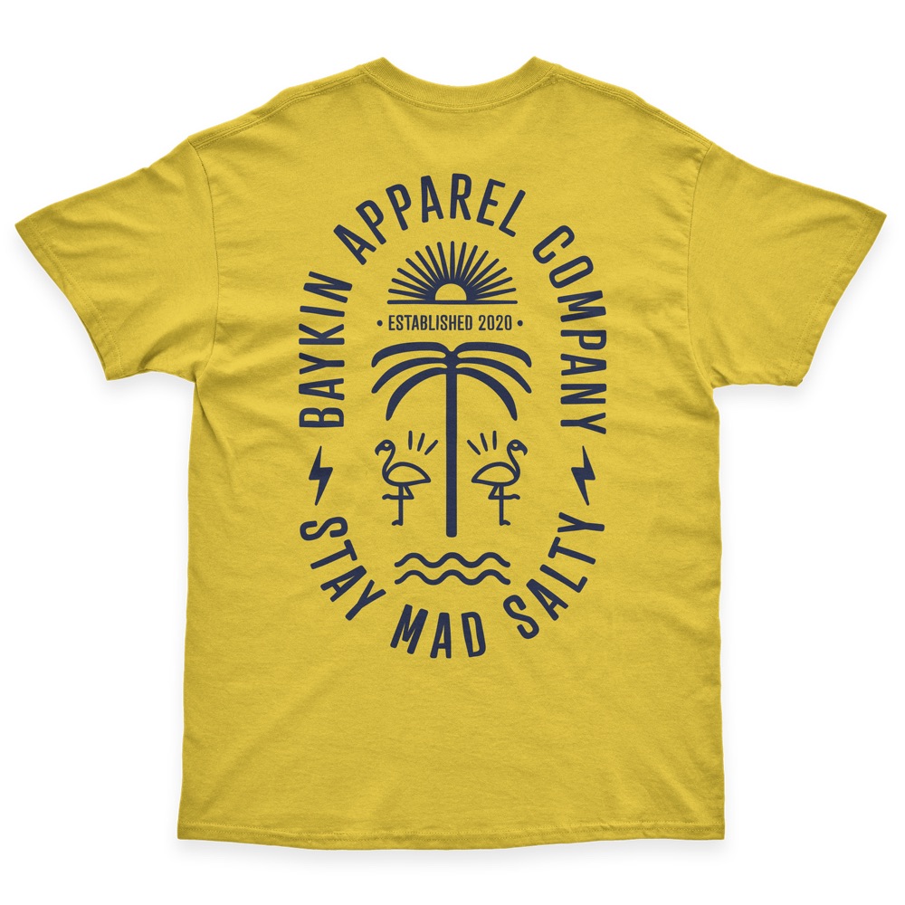
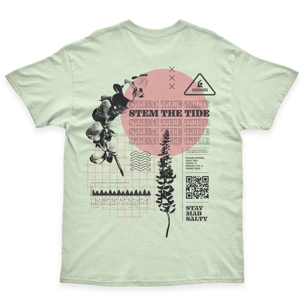
Every shirt is a numbered project with its own story.
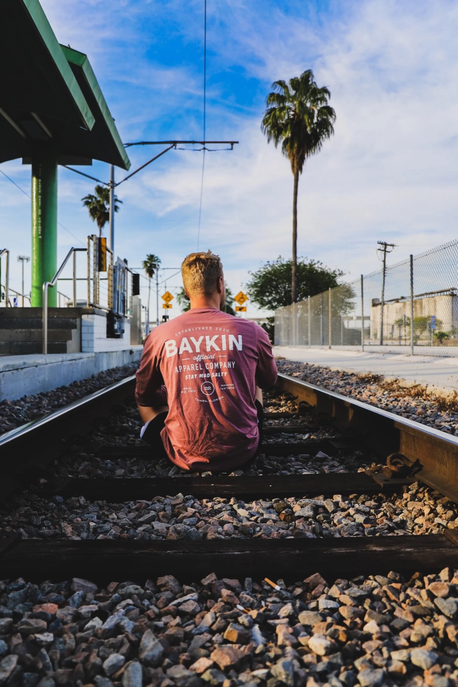
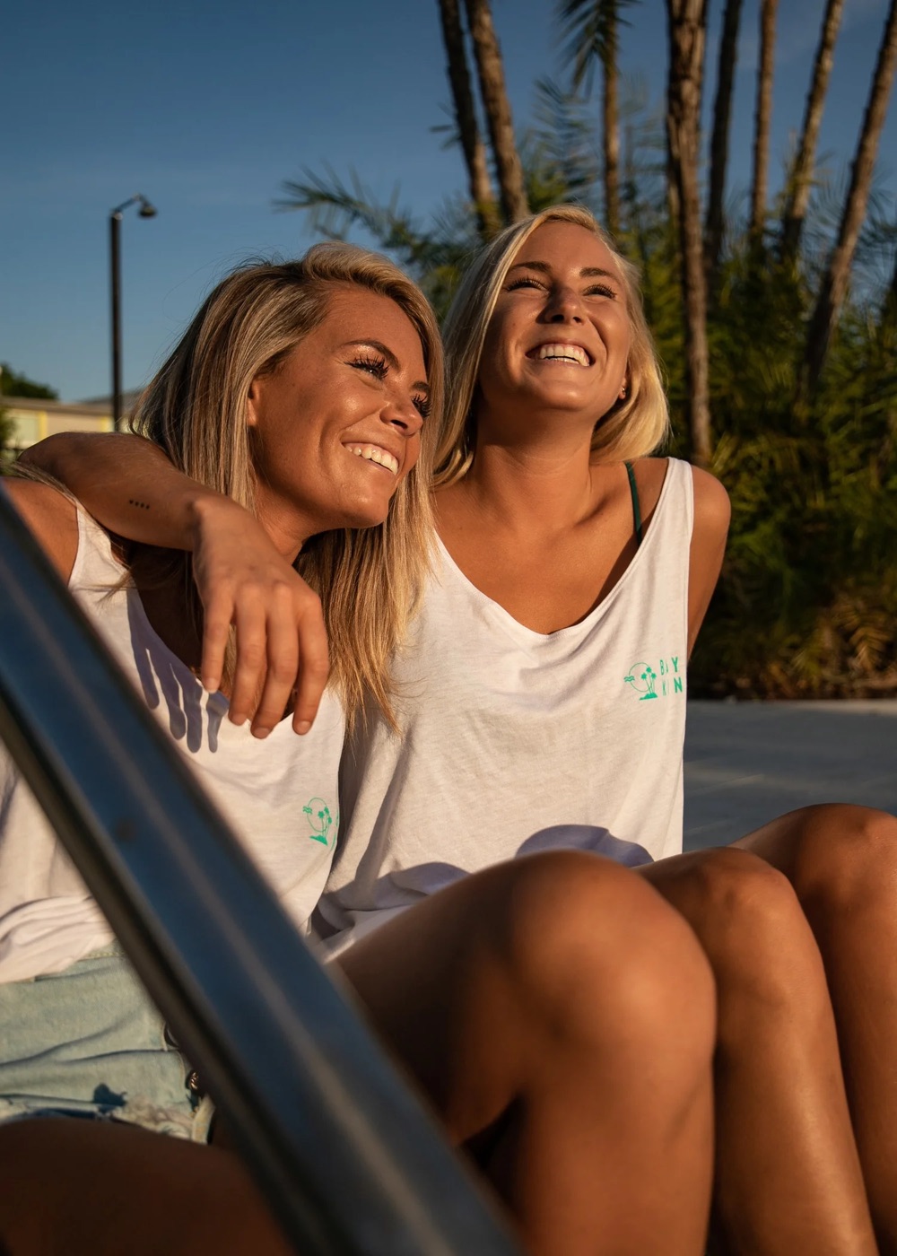
Out in the world
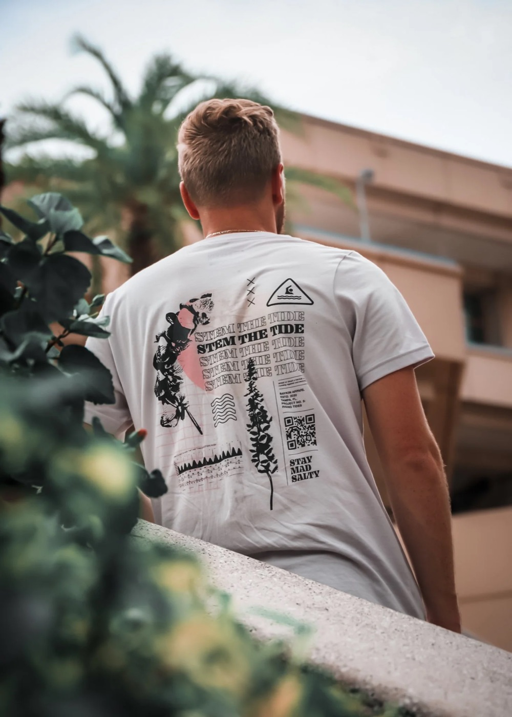
Shot with friends wearing the real product.
Social and the store
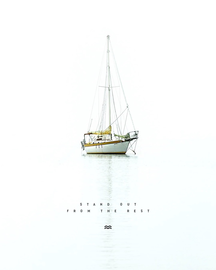
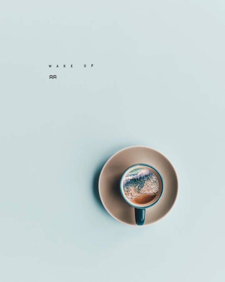
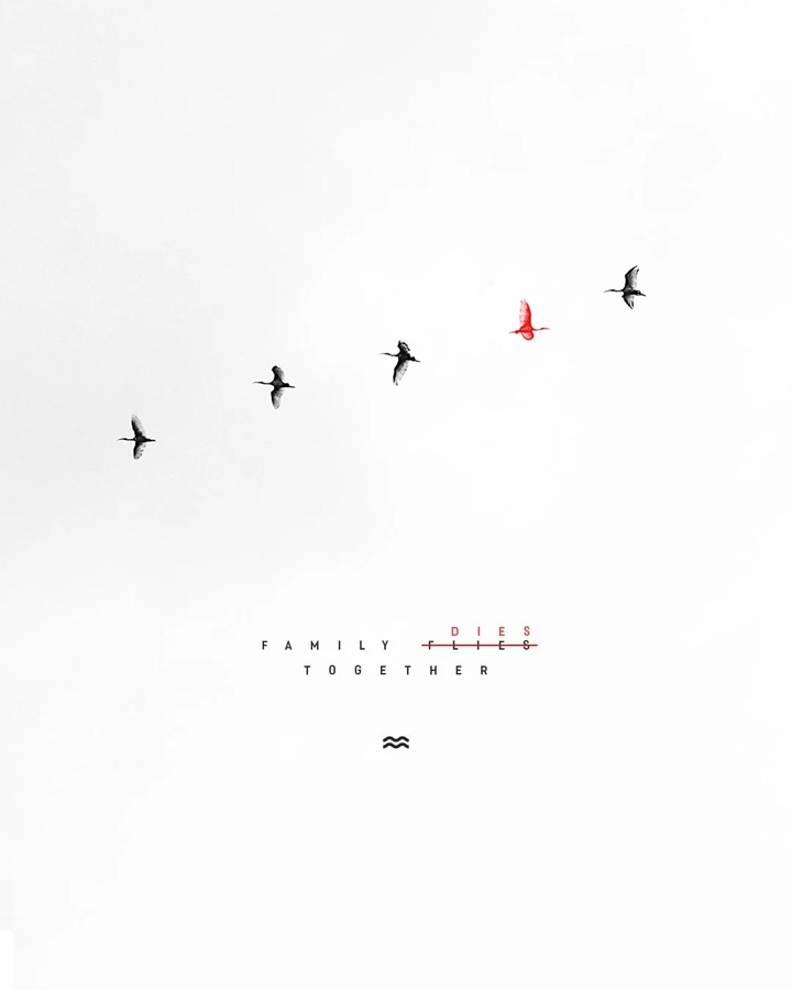
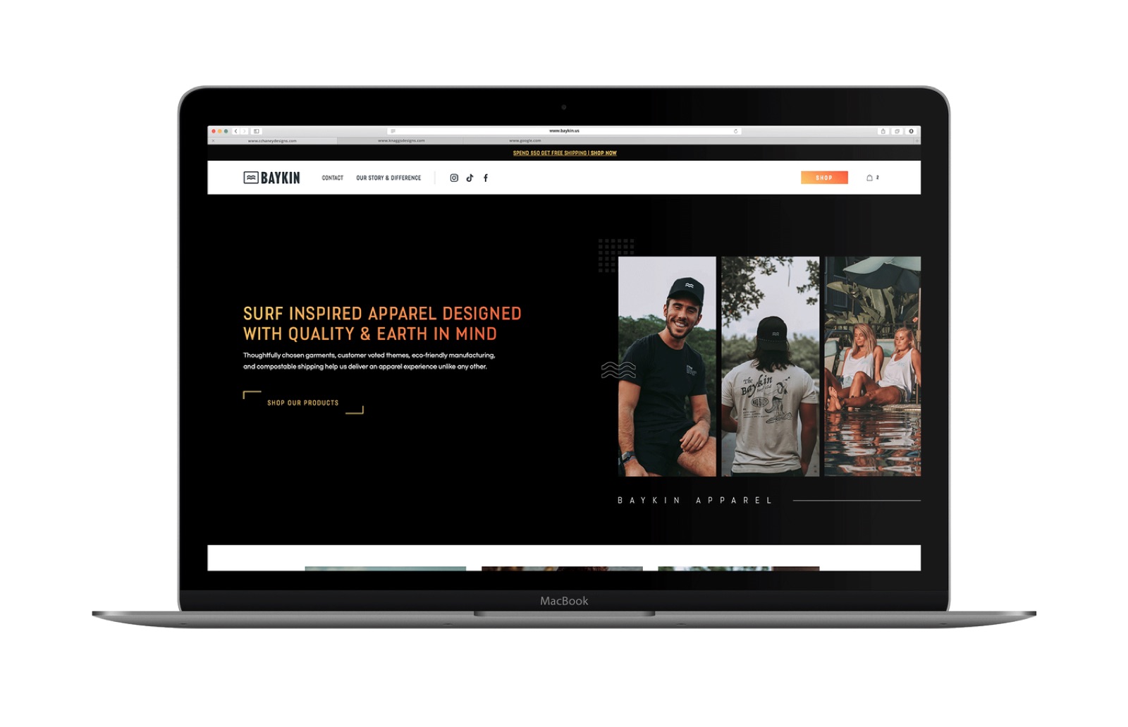
Quiet photos, one short line and the wave mark. The brand carried through to the online store, built by my friend and longtime collaborator Joe.
This is the same process I'd run for your business. Start with the story, then the logo, colors and type, then everything they touch: signs, shirts, packaging, social and your website. Every piece looks like it came from the same place, because it did.
Want a brand people remember?
Tell me a little about your business. I read every message myself and reply by email or text.