BAYKIN APPAREL
CLOTHING COMPANY
This project was one of our favorites here at Chaney Design Co. Born in the midst if Covid lockdown, a couple of my closest friends and I set out on a mission to create a surf apparel brand that we could call our own. The surf/skate style has always been what we dressed in and felt the most comfortable wearing, so we figured that would be the best to try out. With the apparel industry so saturated, we wanted something to stand out from the competition. In order to do that, we wanted an interesting company name, a unique business plan, and a clever logo to tie it all together. So that's what we did.
OBJECTIVE
Bay+Kin= Baykin. Part One: Bay. Referring to both the Chesapeake Bay of Maryland and the Tampa Bay of Florida. These are the waterways we have spent our entire lives around so far and have shaped us into the people we are today. Part Two: Kin. A synonym for family. The people closest to you. What we have become over years of friendship and hope to grow through our apparel. This play on words expresses the companies values of helping the environment that we all grew to love, and building a community that we can share this goal with.
Now that we got the deep sappy stuff out of the way, we can get to the fun part. Did you notice that if you say “Bay Kin” quickly it kind of sounds like bacon? Well that was not on accident. We wanted to have a playful name that both had meaning and humor to connect to the surf/skate community. Because hey, everyone loves Baykin.
With a name as complex as that, of course we needed a tagline to take it even further. The “Mad Salty” tagline emphasizes the saltwater lifestyle that the targets the audience the brand intends, a subliminal reference back to the salty taste of bacon, and with “salty” being a slang term for mad, giving it another of level of playfulness and complexity for the consumer to think through.
Lastly, the logo. Tying it all together, the abstract representation of water using the two wavy lines, can also be interpreted as a strip of bacon at second glance. Once again relaying back to the main focus of surf apparel and water conservation, and the hidden play on words of the “bacon” pronunciation. All of these meanings were thoughtfully planned out to tell a unique story and create a brand to be remembered.
SOLUTION
PRIMARY ICON
Website Designed by Joe Knaggs
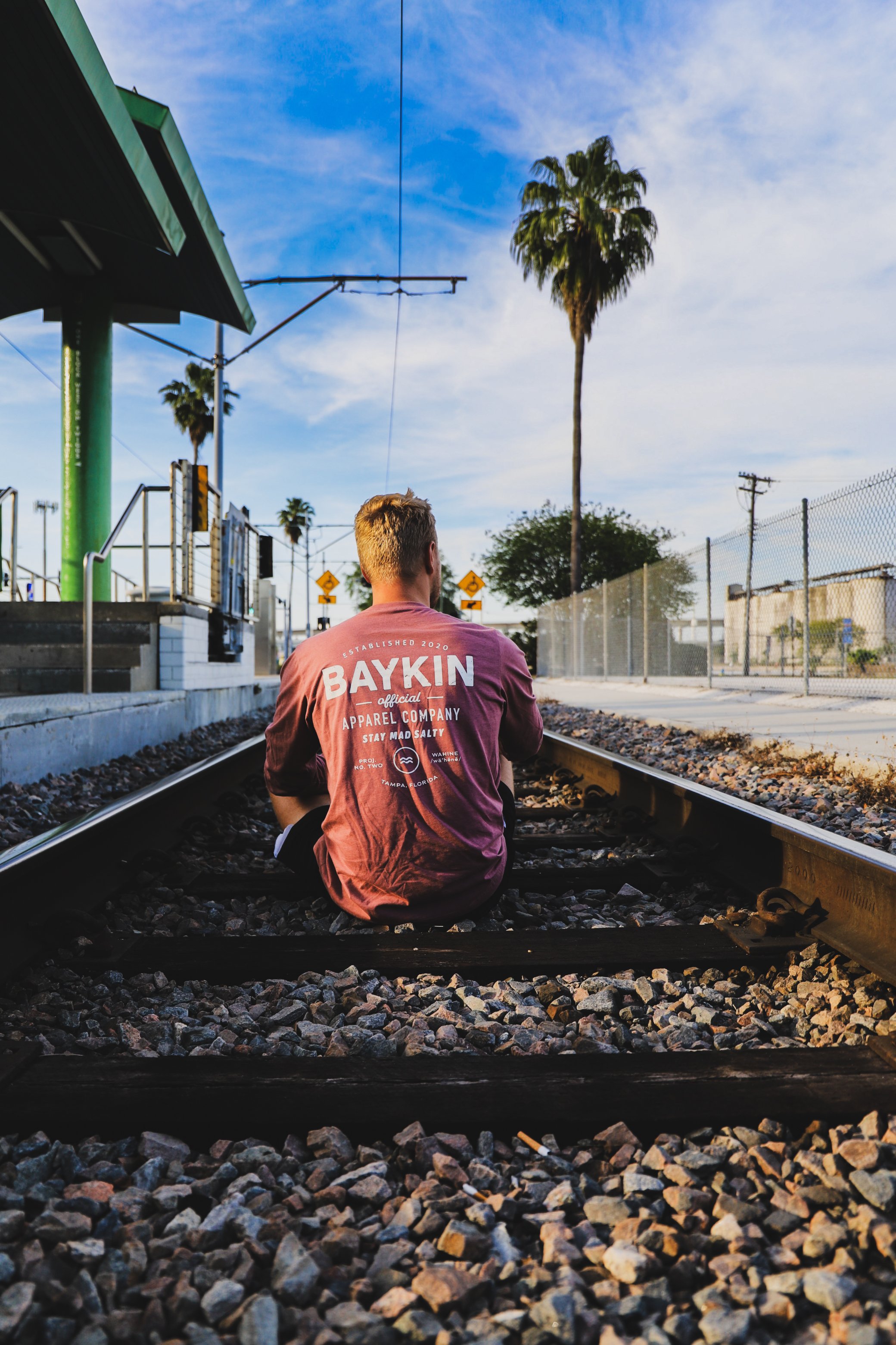
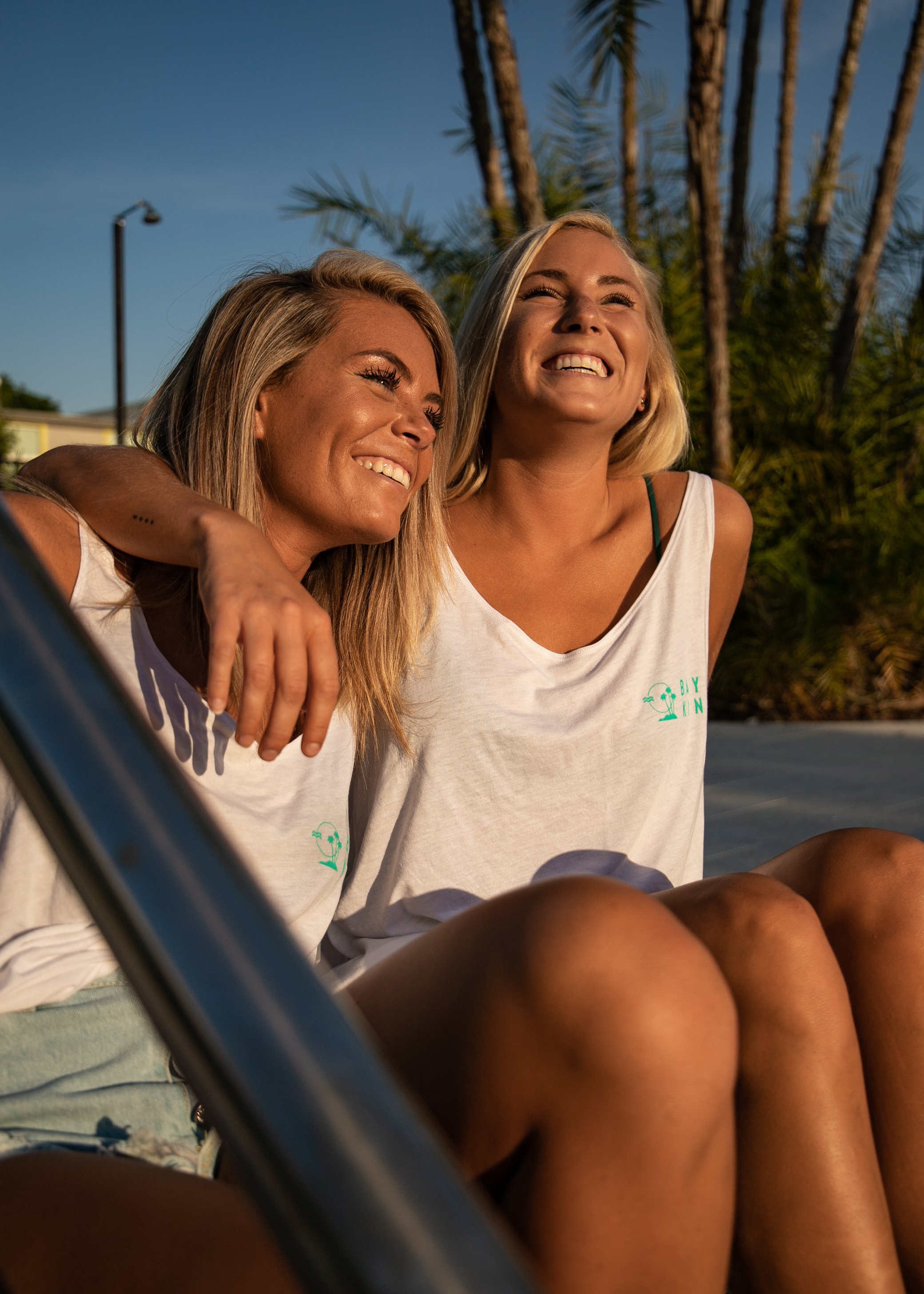
APPAREL DESIGN
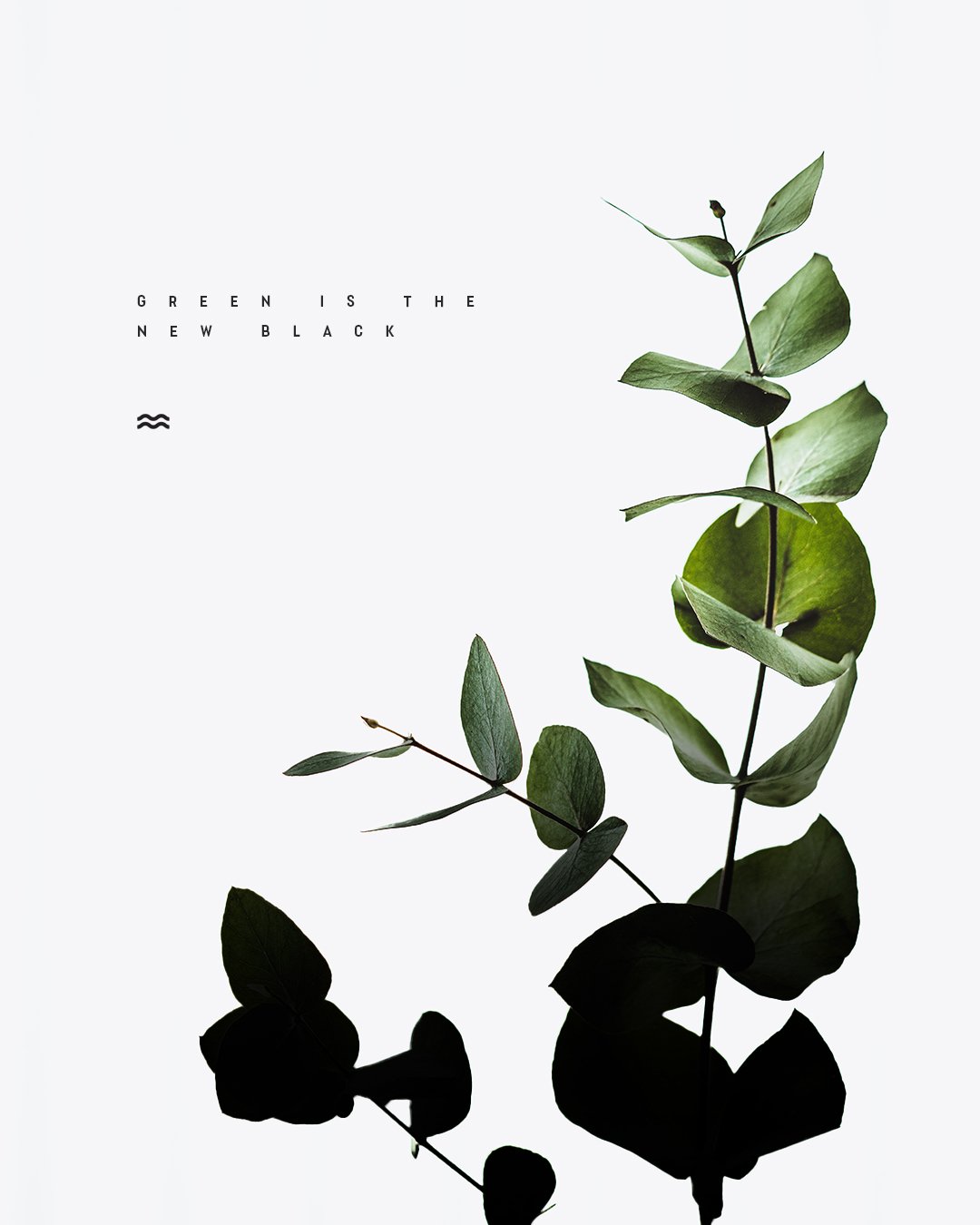
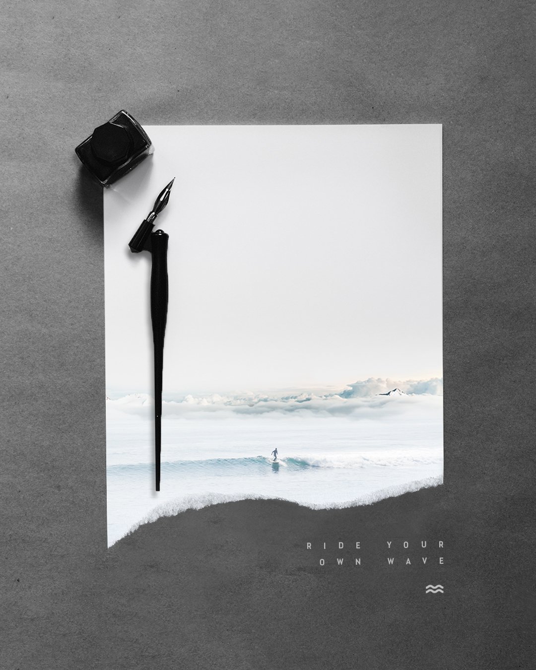
SOCIAL MEDIA ASSETS







SUPPORTING ELEMENTS


