DOG FRIENDLY BAR & WATERPARK
MUTTS & MARTINIS
Mutts & Martinis is a local dog bar that just recently opened in the sunny city of St. Petersburg, Florida. With St. Pete being such a dog friendly town, we thought that a dog bar/waterpark was in fact a great idea and would be a great addition to the city’s social scene. One thing we did not agree with was the branding of the soon to be bar. Dog bars are meant to be a fun and welcoming environment where the customers can feel comfortable bringing their beloved fur babies. A place that is clean and safe to relax, socialize, have fun while they let their dogs play.
If you looks below, you can see the logo and branding style that is currently being used at the bar. We felt that although the logo was quite literal in getting the “Mutts & Martinis” idea across, that it could be executed in a much better way in order to signify those feelings of warm welcomed playfulness that all dog owners look for in a new local dog bar.
OBJECTIVE


After deciphering and picking apart the brand identity, we felt there were a few major components that could be changed in order to take this brand to the next level. First off was the icon. As stated above, the logo does accomplish the goal of getting the name across. Both the puppy paw and the martini glass are very common indicators of the new bars main focus, dogs and alcohol. On the other hand, we felt that the overlapping of the glass and paw print made it hard to read and could be executed in a more creative way. Along with the icon, we thought the typography and color palette chosen was a little stiff and did not quite reflect the fun and inviting feeling a dog bar should denote.
With that being said, we took the components we thought were most important to the integrity of the brand, and gave them a little “twist” (martini pun intended.)
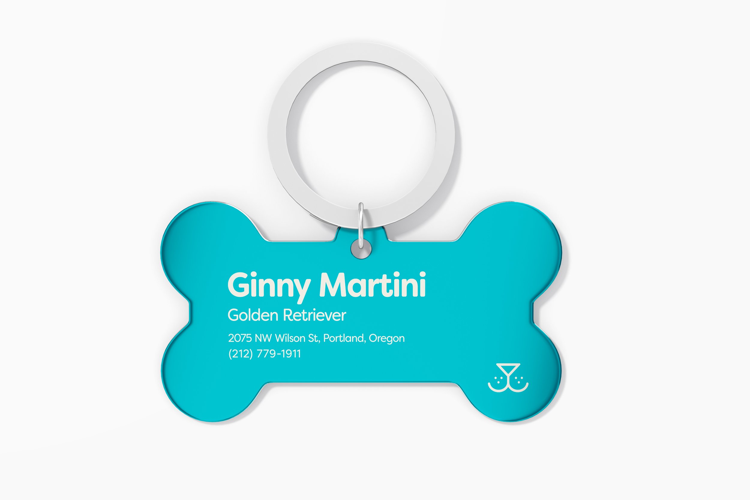
In order to symbolize both the Mutts & Martinis name, we combined the image of a martini glass and the infamous dog “snoot” to create a simple, yet fun icon that is both easy to read and able to use in both web and print applications.
SOLUTION
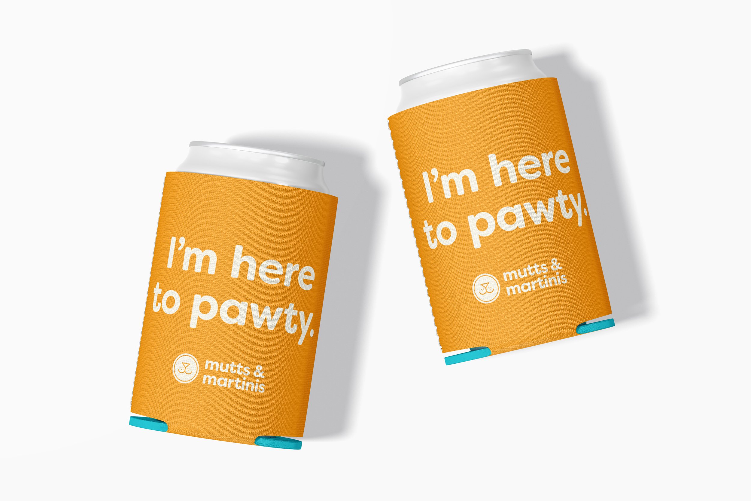
For the typography, we chose a rounded sans serif to not only compliment the icon, but to denote feelings of happiness and the child like energy our furry friends radiate oh so beautifully. Lastly, we took the aqua color found in the original logo, boosted the saturation, and paired it with a vibrant, complimenting orange color to signify the water at the park and to further evoke a bright and happy mood to the target audience.
Overall, we feel that this was a successful rebrand of the new dog bar/waterpark Mutts & Martinis. Although this still remains a concept project, we are hoping that the local establishment sees the potential that the brand could have and hope they consider a brand refresh in the near future.
PRIMARY ICON


